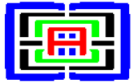

The logo actually has the entire 'word', MegageM, encased in itself.
The logo has a large stylized M around the outside. Just inside the M are two E letters, facing in opposite directions. Inside the E letters is one large dual letter G all in one piece, its own mirror image so it serves as two G letters. At the center, like the word MegageM, is a single letter A.
The logo, as you can now see, spells MegageM, forward and backward. It is self-contained, its own mirror image, like the MegageM palindrome. The logo is itself a palindrome.
 <<-- Back to MegageM Home Page